


What I do!
Design, devise, deliver.
Hi! I'm Sydney and I'm a New York-based designer with a background in theatre. I'm a lover of all things colorful and expressive, and I always translate that into my work.
I work in a multitude of mediums, including logo design, brand design, and illustration. I have also worked as a music director, sound designer, and general visual artist.
Some of my work!


Rock Rising
Branding
01
02
Background
Rock Rising, which produces live events, original theater, podcasts and more, reached out to me regarding an overhaul of their brand. They wanted their branding to feel lighter, approachable, and flexible. Their previous branding was dark and edgy, which didn’t quite fit their identity.
Solution
Rock Rising is a reference to the mountains of Tennessee where the founders grew up. I decided to make a rock mascot and center a lot of the branding around this vintage, yet timeless feel. This new face of the brand channels the creative, yet fun energy that they put into all of their projects.


BFA Drama 2023 Showcase
Marketing
01
02
Background
My colleagues who were graduating with their BFA’s in Drama Performance from Hofstra University in 2023 needed marketing materials for their final showcase. I stepped in to create social media, a cohesive marketing aesthetic, and even their program.
Solution
I decided to play off of some of Hofstra’s color schemes and create light-hearted blue-and-white sky imagery. The playfulness of the actors’ promotional photos played well with this and made for a nice pop of color.


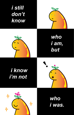
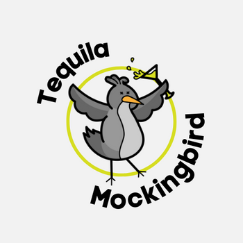
Pushin’ Puddin’
Logo
01
02
Background
A local banana pudding business wanted a professional-looking logo to match their budding business. They wanted something fresh, eye-catching, and unique to their business.
Solution
The business provided some references they liked, so I extrapolated and created a banana pudding character through my own lens. After some tweaks, a banana-inspired color palette, and expressive typography to match, their logo was ready to go.


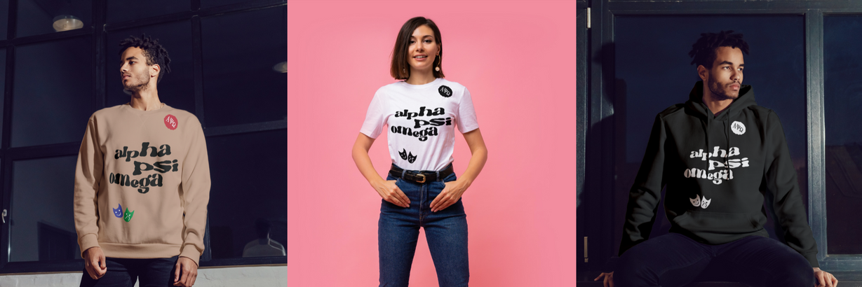
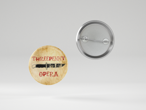
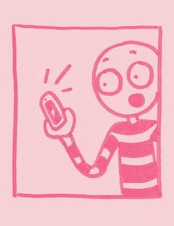
The Threepenny Opera
Merchandise
01
02
Background
I offered to help create pins for Hofstra University’s production of “The Threepenny Opera. They wanted something that would mirror the dark-yet-humorous nature of the show. I also was in it!
Solution
I sketched the lead actor’s face into something that I could further edit and digitize. His character is named “Mack The Knife,” so it only felt right to put his reflection on one. After that, the text and final details all came together perfectly.


Rainbow Rat
Logo
01
Background
A new salon called "Rainbow Rat" wanted a fresh and unique logo to get them started. The client wanted a naked mole rat with tattoos, crazy hair, and epic boots.
02
Solution
After exploring several different initial character designs, we settled on the final mole rat persona. I then tested some punk colors and logotype to create the final product.


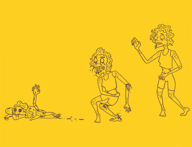
When Friend Was Sad
Illustration
01
02
Background
In my Illustration class in college, we were asked to create children's books with simple designs and stories. I wanted to highlight simple ways to educate about empathy, and so this book was born.
Solution
I doodled these little blobby guys and digitized them. The story then came to life as I explored what their journey was to discovering how to empathize.


